Affichage des articles dont le libellé est character design. Afficher tous les articles

MASK AZTEK


All cartoonists have a secret passion project they cultivate on their spare time. Spare time i don't have  anymore as i got an extra full slate of huge books to produce for many years.
This one was mine, i use the past tense here because i doubt it could see the light of the sun one day. It's time to let go and show it to you... at least the few bits i produced.
It is the comics adaptation of a short story written by the great Paco Ignacio Taibo 2, intituled "MASK AZTEK" or in it's original mexican version "Mascara Azteca y el doctor nuebla". I resume it shortly as  'a mexican V FOR VENDETTA'.

We see the infamous writer José Daniel Fierro returning in his native Mexico to fight against the dictature. He stole an aztek mask in the museum and naked only wearing it, he is photographied and became the symbol of the resistance.
What's not to like with a story like that, except if you are a fascist scum...
Mask Aztek don't pose bomb or such, he make the enemy ridicule, as a stoopid giant who can't close an umbrella before boarding a plane. He of course shoot one or two fascists spawns to defende himself but he mostly organize the uprising of the people.

I worked with my all time favorite novelist on this wonderful story full of wit, action and political chess and it was awesome. I produce an handful of the best pages i ever did. But nobody wanted to publish it. Comics is still a bad word in France, fuck.

So now , after 12 years i decide to stop dreaming and show it to you...
Ladies and gentlemen, let me introduce you to MASK AZTEK!


I did some teasers for it and even an animated gif... who ended becoming the animated title of the greek documentary LATIN NOIR who is about mexican noir authors, which i also did the logo for. It had also Paco reading the first chapter of CUATRO MANOS* while my pages were seen on screen.

*(the book adaptation we worked on before our editor went chapter 11, and noone would continue with us...)


Here the poster that Mask Aztek paste on the wall of mexico D.F. at night on top of the dictature propaganda...


And also some teasers...


And some inking drawing.
You can see that this project is so old, i did it on paper...


So long Mask Azek...

TUCO...

Rip ELI WALLACH (25/06/14)

Tuco Benedicio Pacifico Juan Maria Ramirez est de loin mon personnage de fiction préféré.
Avec lui on passe du rire aux larmes. Il nous faut arriver à la moitié du film "LE BON , LA BRUTE et LE TRUAND" pour se rendre compte que les trois persos, sont à tour de rôle chacun un peu BON, BRUTE et TRUAND... quoique le coté "BON" de SENTENZA/ANGEL EYES ne saute pas aux yeux... ^^

j'ai fait ce sketch pendant que je regardais le film, un oeil sur YOUTUBE et l'autre sur PHOTOSHOP, une petite habitude qui aide à assurer les parties mécaniques et répétitives de ce beau métier.


BARBUDOS #1

Few times ago, i dug in the bottom of my hardrives to find some materials to post in here since i'm working on comics projects i can't show right now. After opening hundreds of files, something strange came up... i saw a lot of bearded men in my images, and when i say A LOT, believe me.
I work mostly on crime stories and those manly men stuff, so it's not a big surprise to see an high amount of facial hair on those comics pages, but my SCI FI stories are also filled with facial hair and also my funny stories. TWO of my last THREE books had bearded men on the cover.
So as a game, i start to putting in a folder all my BEARDED ILLO, and may be one day paste them on the same page. A man must not fight his obsession, even the graphic ones. So i did just that and it filled one full page of 12 square picts... and i wasn't even finished. Before i had finished i did TWO more, i'll show them to you later...
I choose the theme of this first GRAPHIC OBSESSION series, it's called "BARBUDOS", which means of course BEARDED MEN in Spanish, and most precisely in CUBAN. FIDEL CASTRO and most of his compadres in the SIERRA MAESTRA didn't took time to shave when they did the revolution hidden in the moutains, they had too little time for vanity, they just wanted (at the beginning) just get rid of Batista the dictator. When they won (you can see that part in THE GODFATHER PART 2 and in CHE part 1 & 2), they were the Men. To blow up steam, they play BASEBALL. FIDEL & his men out together a team and named it "BARBUDOS" because that's who they were. They didn't shave after the victory.
Many years later, when i worked on the comics adaptation of the novel , CUATRO MANOS (FOUR HANDS) with his author PACO IGNACIO TAIBO 2, he told me that story, and suggest that one of the character (JULIO, the mexican journalist) should wear a BASEBALL shirt of this particular Cuban team.
Then here we are 10 YEARS later, with a series of details of my illustrations.
People, i'll give you "BARBUDOS" part 1.


pict 1 > 3 - BRONSON (BAGMEN) / ICEBERG (BAGMEN) /AKUMYO (GAT - DIRECTOR'S CUT)
pict 4 > 6 - HARAKU (GAT - DIRECTOR'S CUT) / SANBON-NO-YUBI  (GAT - DIRECTOR'S CUT) / BYRON (CHARGER)
pict 7 > 9 - ##### (#####) / McQUEEN  (CUBA LIBRE) / CHUCK NORRIS (BE A REAL MAN)
pict 10 > 12 - BRONSON (HAPPY 2013) / JERRY SIMPSON  (I, MOBSTER) / DARK SAID (COMICSHOP)

GAINSBOURG & BIRKIN paparazzi shot

 when i did this image, i had too many color choices. so i animated them and voila ^^
SERGE GAINSBOURG and JANE BIRKIN are now flashed by paparazzi.

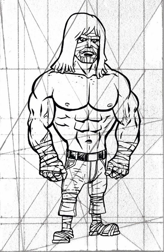
LUTHER STRODE pin up

I was ask to do a pin up for LUTHER STRODE, 
it was sadly unpublished but i like it so i show you a little bit of process, hope you like it.

As you can see, i use a grid to check if all the strong lines are well adjusted, i got many differents grids and use one or the other, each drawing is special and need special care. This grid seems pretty old or draw very small to have this kind of texture. I found it on an artist tumblr (i'll put the name as soon as i can find it...)

 
Now, i have the INK PHASE done.
I was looking for a satirical tone, i thought the others artists would be better in the ultraviolence mode, and i was pretty late already and barely made it while working on my 180 graphic novel BAGMEN. I played with big lines and oversimplification of forms as the hair or muscles.
I always found funny the heavy metal hair cut of LUTHER STRODE, it change quite a bit between volume 1 & 2, and i choose to draw his hair as STRAW ^^.


The bold lines should be clear as possible, almost only silhouette, no fold. I should be able to draw the silhouette in one take if i wanted. then i could worry about the colors.

Didn't block the zones as usual, i work with textures, only the heavy metal straw hair was a flat.
Played with the selection and opacity to acheive what i wanted : rich textured dirty from down to waist desatured colors. Then the BLOODBATH begun. And if you have read LUTHER STRODE, you know that the blood is used in gallons, in tanks, in pools... i choose a simple BLOOD SHOWER.

Then i blowdryed the mother fucker, i wanted that the reader think that all the carnage didn't took place in ONE SETTING. The blood drye fast and when LUTHER catch the thug, the blood is a little pale on his body but vivid on the fist he just finished using.
A few splat of blood and some drips and... i decide to get ride of the hand painted acrylic texture in background. paste a simple "PAPER" texture scanned form a page of "HUMBUG" by HARVEY KURTZMAN (yeah, i know name dropping is pretty lame, but this is the Amazing casa of Amez, and i really like KURTZMAN). All the colors are done. Now the nerves wrecking time of finding the right color tone and hue for the image. This part alone can take 5 minutes to 3 hours... too damn many choices available on photoshop. Sometime you surprise yourself, just by changing the layers propriety... have a look...

I test many permutations, i like dark images, so it's always a problem for me. I forget that they need to be printed and sometime you have very distrubing surprises. So now i make my colors a little lighter then previous years. Still like the RED a lot. More easy to balance. Less superstition about it. One time, one of my illustration was refused because the D.A. didn't like the GREEN. He was afraid of the GREEN. "GREEN= BAD MOJO... you make it in blue, graphic slave for hire."

I add the speed lines... and adding speed lines to a character i built to be massively unmovable, that's satire 101, my friend... ^^


and voila!

It never sees print, but i like it.

teaser #1

2011 sera ULTRANOIR.


plus de news, very soon.