

I was ask to do a pin up for LUTHER STRODE,
it was sadly unpublished but i like it so i show you a little bit of process, hope you like it.
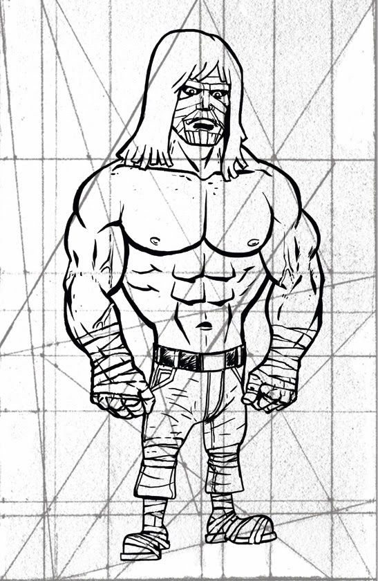
As you can see, i use a grid to check if all the strong lines are well adjusted, i got many differents grids and use one or the other, each drawing is special and need special care. This grid seems pretty old or draw very small to have this kind of texture. I found it on an artist tumblr (i'll put the name as soon as i can find it...)
Now, i have the INK PHASE done.
I was looking for a satirical tone, i thought the others artists would be better in the ultraviolence mode, and i was pretty late already and barely made it while working on my 180 graphic novel BAGMEN. I played with big lines and oversimplification of forms as the hair or muscles.
I always found funny the heavy metal hair cut of LUTHER STRODE, it change quite a bit between volume 1 & 2, and i choose to draw his hair as STRAW ^^.

The bold lines should be clear as possible, almost only silhouette, no fold. I should be able to draw the silhouette in one take if i wanted. then i could worry about the colors.

Didn't block the zones as usual, i work with textures, only the heavy metal straw hair was a flat.
Played with the selection and opacity to acheive what i wanted : rich textured dirty from down to waist desatured colors. Then the BLOODBATH begun. And if you have read LUTHER STRODE, you know that the blood is used in gallons, in tanks, in pools... i choose a simple BLOOD SHOWER.
Then i blowdryed the mother fucker, i wanted that the reader think that all the carnage didn't took place in ONE SETTING. The blood drye fast and when LUTHER catch the thug, the blood is a little pale on his body but vivid on the fist he just finished using.
A few splat of blood and some drips and... i decide to get ride of the hand painted acrylic texture in background. paste a simple "PAPER" texture scanned form a page of "HUMBUG" by HARVEY KURTZMAN (yeah, i know name dropping is pretty lame, but this is the Amazing casa of Amez, and i really like KURTZMAN). All the colors are done. Now the nerves wrecking time of finding the right color tone and hue for the image. This part alone can take 5 minutes to 3 hours... too damn many choices available on photoshop. Sometime you surprise yourself, just by changing the layers propriety... have a look...
I test many permutations, i like dark images, so it's always a problem for me. I forget that they need to be printed and sometime you have very distrubing surprises. So now i make my colors a little lighter then previous years. Still like the RED a lot. More easy to balance. Less superstition about it. One time, one of my illustration was refused because the D.A. didn't like the GREEN. He was afraid of the GREEN. "GREEN= BAD MOJO... you make it in blue, graphic slave for hire."
I add the speed lines... and adding speed lines to a character i built to be massively unmovable, that's satire 101, my friend... ^^

and voila!
It never sees print, but i like it.